After such a long hiatus, you might expect a tremendous, ground-breaking update, with fancy new features and optimizations to make Sierra Mapper even speedier than ever!
Unfortunately, you'd be (mostly) wrong.
I have spent the last few days in a rare flurry of fingers; updating code and rubbing my temples; doing my damnedest to remember how this whole thing works. The result: I do have a barrage of trivial changes!
The good news is that I'm throwing more data in your face! Yay! You can take this data and spreadsheet-nerd long into the night!
The bad news is that all routes will have to be recalculated. Links to existing routes should still work just fine, but the first visit to those routes will be painfully slow. Fear not; subsequent visits should be snappy.
I've run out of things to say that aren't the trivial updates, so without further ado, here's a summary of the updates in the order
- Downloadable .csv tables with route information
- Downloadable .csv files with elevation profiles, so you can geek out creating and labelling your own elevation profiles
- Improved label economy on profiles! Hopefully, no more stacked-label-fests that used to occur around areas with many features
- 400% more excitement on that boring cumulative ascent/descent graph
- Improved accuracy on the real-time route distance calculations
- A database that is now (hopefully) usable
- A donate button (really more of a feature for me than for you, to be honest)
Trivial Update #1: Downloadable .csv data tables with route information
I am admittedly biased, but I think Sierra Mapper is great tool for the early stages of route planning. You can pick a trailhead, and in minutes, have a good sense of what on-trail options exist for adventures in your mileage range of interest. Sierra Mapper does this equally well no matter what trailhead or route, but that flexibility comes at the cost of its specificity, and ability to provide even more detail for features of interest and importance, while rejecting those that are inconsequential.
I struggled for a while with how to deal with this; I toyed ideas of other ways of presenting route data. Yet all of the approaches I could come up with came at the cost of reduced generality and decreased utility for some aspects of some routes.
"Not Good!", said I, squinting at my supposedly route-agnostic planner.
Ultimately I decided that perhaps diving into greater detail is best done by you, the route planner, in whatever fashion you prefer to. But at the least, I can help--I can aim my digital fire hose at you, and provide all the detail that I have for each route .
And that brings us to the downloadable .csv tables. When profiles are generated, Sierra Mapper tries to pick and choose what to show you, and what not to show you. It does a pretty good job, but I want you to have the whole kit-and-caboodle...
So BAM! Now you have it.
To download the table, simply calculate a route, then click on the gray "Download Data Table" button. It's located at the bottom of the Route Summary, and looks something like:
After clicking on the button, you should be prompted to open or save a .csv file. If you open it in csv-friendly software, you should see something like this:
Hooray, data!
The column headers make the content pretty obvious, but here's a brief explanation:
- Profile Label Number - If you look at the elevation profile, you'll see the numbers on the labels correspond with certain rows in the csv. The Profile Label Number provides that correlation. If the Profile Label Number is 0 or -, it means the label was either combined with the preceding label or omitted from the elevation profile.
- Point Number - This refers to the index of the point in the elevation profile. What use is that to you, you say? You don't have the elevation profile data itself? Maybe I wrote these updates in the wrong order. See Trivial Update #2: Downloadable elevation profiles. Example: If the Point Number is 72 it means the label belongs in the 72nd point of that mysterious downloadable elevation profile I keep alluding to.
- Cum. Distance - Cumulative distance. Why are you smirking?
- Cum. Terr. Distance - Cumulative terrain distance. Same as above, but now the 3D path length of the trail, rather than the 2D projection of it.
- Elevation - If I have to explain it, you probably don't belong here. Bah, now I feel guilty. It's the elevation of the point. In feet. Above sea level. C'mon.
- Cum. Ascent - Cumulative feet of ascending. Calculated with signal processing magic!
- Cum. Descent - See above; same magic.
- Label - This is the text that appears (or would appear) on the elevation profile
- Lat. and Long. - If you don't know what these are, then go learn something. Go ahead. I'll wait.
Trivial Update #2: Downloadable elevation profiles
There was a spoiler above; I know.
You know those pretty elevation profiles that Sierra Mapper effortlessly creates for you? Well, now you can it yourself, too! Of course, it'll take you far more effort.
Combined with the data table above, you can create custom elevation profiles, that include the details you care about, and omit those you don't.
Go back to the Route Summary page - the page you're taken to just after calculating a route, and scroll down again. Do you see the button that says "Download Elevation Data"? Guess what that does?
Yep! Click it!
Open the file provided in your preferred csv manipulating software: Excel if you're adorable when you do math, MATLAB if you got an engineering degree 10 years ago, or Python if you're enlightened.
If you're adorable, you should get something like this:
Hooray, data!
I opted out of abbreviation in the column headers, so they require no explanation (and induce no snickering).
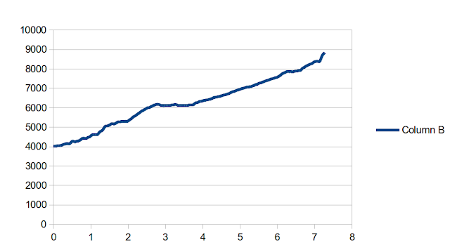
If you highlight a bunch of column A and B, and create a chart, you should get a pretty crummy chart like this:
 |
| "Why, that's the same elevation profile as my route!", is what you might be saying, if you have terrible foresight. |
Now it may be a crummy, label- and unit-less chart, but it's yours - yours to manipulate, and fiddle with, and annotate, etc. Who knows--maybe somebody out there will create elevation profiles that are stylistically better than Sierra Mapper's1?
Trivial Update #3: Improved label economy on profiles
As controversial as label economy might be, I will not only broach the topic; I will now drone on for quite a while about it.
One of the problems that exists in Sierra Mapper is that, well: when there's a bunch of shit that's close together, labels get awful. They get crammed together and end up floating 30,000 feet above the surface of the Earth. Who can even read them way up there? Nobody backpacks with a telescope.
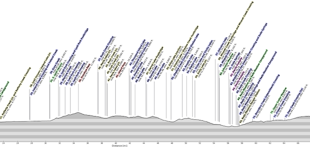
I've added some logic for better combining of labels, and some shortening of the text when it becomes unwieldy. See this before and after:
 |
| Old Version: Pure chaos. |
 |
| New Version: 3% less chaos. |
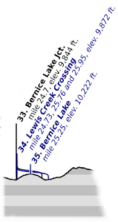
In instances where labels have been combined, I've added neat swoopy curves to tie the points together. Here's a better look:
 |
| I did warn you that these updates were trivial.3 |
I work with data quite a bit, and I have to present it quite frequently. Effective presentation of data is a few parts art, a few parts science, and a few parts sociology.
There is one universal truth: if the presentation of a given set of data is weak, and you don't know how to fix it, annotate. Annotate the heck out of it. If you do that, then maybe people will be too busy reading the annotations to notice that you don't really have a point to make with the data.
That's not a particularly endorsing segue, is it?
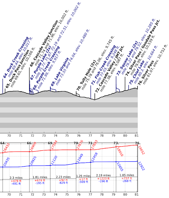
The NEW and IMPROVED cumulative elevation change graph has been annotated. It's had the heck annotated out of it.
But I do think the product is better. An excerpt is below:
 |
| Hooray, data! |
- See those big fat black numbers at the top of the bottom chart? Those refer to the numbers of the profile labels above. Some get skipped, because I couldn't cram all the annotations in the bottom plot. So you have to look at the big fat black numbers to figure out which profile labels you're comparing.
- See the red and blue numbers that are tilted at 60 degrees? Those are simply labels on the cumulative ascent (red) and descent (blue) curves that indicate their values (in feet) at that location.
- Example: When you reach Label 66. (Cascade Valley Junction), you'll have done 16,909 feet of climbing, and 10,925 feet of descent on the entire route, up to that point.
- The black, red and blue horizontal labels indicate the mileage, ascent and descent between the two indicated locations
- Example: Between Label 66 (Cascade Valley Junction) and Label 69 (Lake Virginia), you'll go 1.81 miles, climb 674 feet, and descend 195 feet.
Trivial Update #5: Improved accuracy on real-time route calculations
This was an easy but desirable fix: Now, when planning a route, the indicated on-the-fly mileage shown on the mapping page will match the calculated route's mileage. So, you only need to calculate the route if you: want to see the profile, want to know how much ascent or descent there is, or want the link to return to the route later.
Nifty!
Trivial Update #6: A (hopefully) usable database
The route database should be a pretty useful thing, since it should allow you to easily revisit routes you've previously planned.
Unfortunately, trying to actually access the database requires a three minute wait, and returning to the database from any entry requires the same wait.
I may have fixed the problem by reducing the resolution of the profiles displayed in the database. This shouldn't negatively impact functionality, because the old ones were so tiny you couldn't make heads or tails of them anyway. The new ones are simplified, but at least give you a sense of the profile:
 |
| Real mountains aren't this stripy |
Time will tell if this is enough to keep the database snappy.
Trivial Update #7: A donate button
Ah, the best for last.
Sierra Mapper has been happily chugging away for the last year; CPUs in some closet in Arizona hum while screaming through billions of ridiculous floating point calculations, all to determine just how many times you crossed the South Fork San Joaquin.
Sierra Mapper gets a few thousand hits per day, leaving many (hopefully) satisfied customers walking away, routes in hand; eyes sparkling with thoughts of their upcoming adventures.
I haven't dedicated much time to Sierra Mapper in the last year. Depending on responses to these updates (and usage of said donate button) I may or may not spend much time on it in the future. It works; it has lovable quirks, but it works.
Still, I pay for operating costs out of pocket, and I doubt I'll want to do that indefinitely. I refuse to add advertisements as a solution--that's a piece of capitalism that I want no part of.
So this is my first attempt at a solution: a donate link. It's located both on the title bar of this blog, and at in the header menu of the app itself.
A few generous souls have already asked how they could donate, and have sent donations. I am wholly grateful for them, and they've offset the costs for part of the last year.
What I ask of you is simply: if Sierra Mapper is useful to you; if you'd like to see it continue to exist, and especially if you'd like to see it grow and improve, send a donation. Doesn't have to be much. A few bucks. If everyone who used Sierra Mapper did that whenever they actually took a trip--a few times a year; sent $1 or $3 or $5--I think the site would be self-sufficient. Heck, might even be able to hire a real programmer to fix some of the garbage4 !
This isn't a cash-grab, or extortion--I'm simply trying to determine if it's worth it to keep the site running.
If you do send a donation, no matter how small; if there's a feature, function, or mapped area you'd like to see added, send me a note using the contact form to the right.
1 Naw.↩
2 Except you, Darryl. None of this is for you.↩
3 If you find yourself squinting at the swoopy curve, wondering whether or not it's a hyperbolic tangent function, wonder no longer: It is!↩
4 Probably shouldn't call it garbage in the donation section.↩


